Last month I happened to meet two people who have different problems in using their iPhones. This is not the first time that people have asked me about iPhone’s hidden features though, it did make me think about what is behind this and what I can do about it.
The problems they reported were both related to the concept of affordance in product design. According to Donald Norman, the author of the book The Design of Everyday Things, affordance “refers to the perceived and actual properties of the thing, primarily those fundamental properties that determine just how the thing could possibly be used.”
For instance, a text box affords writing and a button affords clicking on a web form. You don’t need to provide instructions like “please fill in…” or “please click…”, and people will know what it’s about. This is how affordance can be illustrated in everyday life. In this article, I would love to share some problems my friends had met in their daily use of the iPhone and my thoughts on the application of affordance in design.
How to Add Reminders
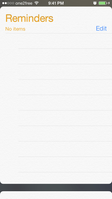
Knowing that I am an iPhone user, my doctor asked me one day how to use the Reminders App on iOS. As a loyal user of iPhone and a firm believer of Apple’s reputation in designing great products, I thought it would not take me long to find out how to use this but actually I was wrong. At first my doctor showed me how she tried to use it: she opened Reminders, tapped on “Edit”, chose the note colours which were listed and then – stopped at this step. We tried to look for a button that would imply adding a reminder, but failed.
The Reminders App’s screen gives users no cue on how to use it. Having a relatively small screen does not necessarily mean that people would stumble upon the hidden controls quickly. By trial and error, I eventually found out that to add a new reminder is to tap on a blank line. I ended up making a deck of slides to show my doctor how to use the Reminders.
How to Close Running Apps
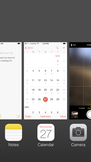
About 2 weeks ago, a man sitting next to me on the MTR train asked me how to close the running apps on iOS 7. He probably reached out to me because I was focusing on playing my iPhone. I asked the man how he expected to close the apps. (I could have told him how to do it right away, but I really wanted to study his behaviour). He double-tapped the Home button, looked at the screenshots of the apps, and tapped one of the screenshots. He asked me why nothing happened. He said he had expected to get an “x” button which he could tap to close the app like what he did before on iOS 6. Later he tried to dragged the screenshot in different directions. Again, nothing happened. It looked like he had exhausted all the possible ways he could think of to close the apps.
The screenshots give people no cue on how people should do to close the running apps. Even though the number of ways that people can manipulate a virtual object can be small, people do not necessarily stumble upon the appropriate ways that quickly. At the end, I showed the man how to close the running apps by swiping up the screenshots.
Think Affordance
Recalling these two incidents I’ve met recently, I felt that the Reminders app does not look like it could afford adding reminders. Also, the screenshots of the running apps do not look like they can afford closing. The gestures needed are not obvious to be figured out.
What about your products? Do the perceived or actual properties of them help your users understand how they can be used? I hope after reading this you would also think about this question in your product design.
This article was written by Ada Yuen, Senior Usability Consultant and Co-Founder of AddiThink.